
2024 Color Trends: Embracing Warmth, Blues, and Nostalgia

As we get closer to stepping into the new year, the world of colors is abuzz with exciting trends, that aim to bring warmth, tranquility, and a touch of nostalgia to our lives. Let's dive into the hues that are poised to dominate the palettes and homes throughout 2024!

The Blues Take Center Stage
Blue emerges as the protagonist in 2024's color saga, with multiple giants in the industry showcasing their unique shades:

Benjamin Moore's Blue Nova: Partnering with Blue Origin (Jeff Bezos' aerospace company), this rich blue hue, Blue Nova, demands attention but harbors a subtle, mysterious undertone that may surprise under different lighting conditions.

Sherwin-Williams' Upward: Picture soft blue jeans—this pastel-like shade, Upward, evokes tranquility, creating a calming ambiance ideal for spaces meant for relaxation and rest. Upward's pastel-like qualities not only imbue rooms with a sense of calm but also add a touch of coastal charm, reminiscent of the soothing tones of seaside landscapes.
Valpar's Renew Blue: Leaning toward blue-green, Renew Blue aims for a serene ambiance. This nuanced hue offers a calming touch, infusing a sense of peace and tranquility wherever it finds a place. Its gentle blend of blue and green tones makes it an ideal choice for those seeking a soothing and harmonious atmosphere in their surroundings.


C2's Thermal: C2's Thermal, with its sky blue hue, exudes a vintage vibe perfect for bedrooms or coastal-themed spaces. This serene shade evokes memories of tranquil summer skies, offering a timeless charm to contemporary settings. Its versatility allows it to blend seamlessly into various decor styles, promising a soothing atmosphere wherever it graces a wall. Thermal stands as a testament to the enduring allure of nostalgic tones in modern design.
Pastels Resurge: A Nostalgic Touch
Pastels are making a triumphant comeback, infusing a delightful sense of nostalgia reminiscent of the vibrant '80s. Within the blues, subtle hints of pastel hues are emerging as a nod to this revival:

Sherwin Williams' Persimmon: In the spotlight is HGTV Home by Sherwin Williams' Persimmon. This charming shade not only complements the Upward blue but also introduces a pastel vibe that vividly echoes the spirited atmosphere of the '80s. Its playful yet sophisticated undertones serve as a delightful throwback while seamlessly blending with contemporary aesthetics.
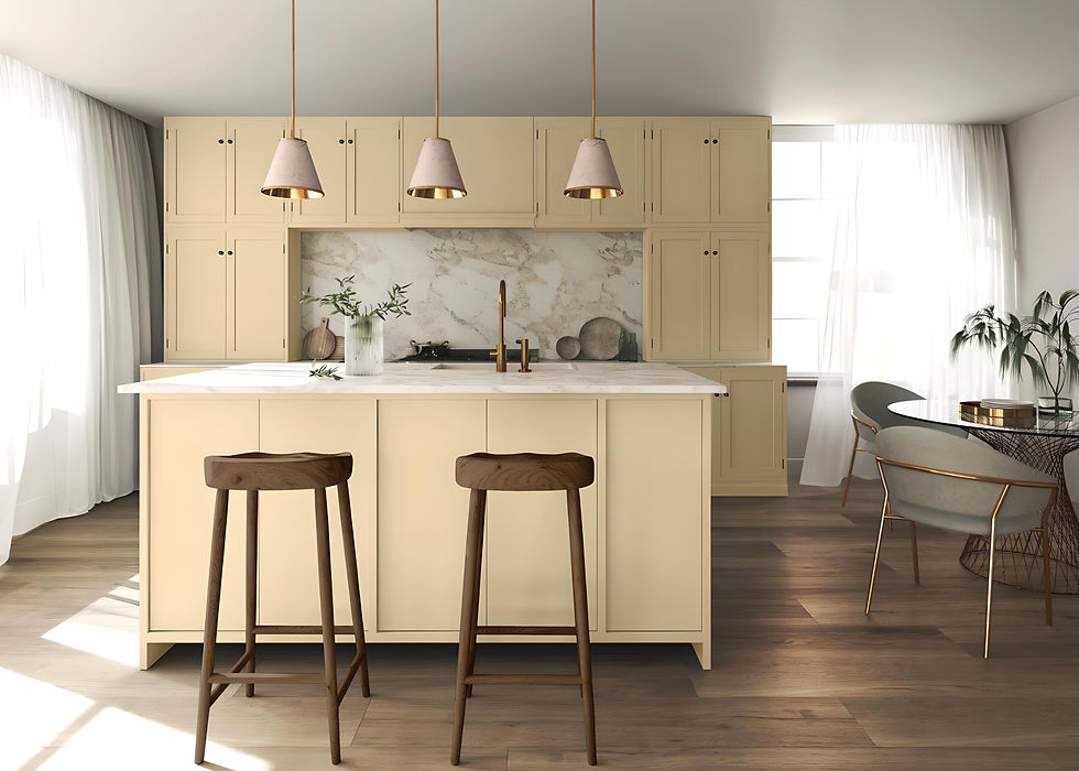
Glidden's Limitless: Limitless brings a refreshing and versatile pastel shade to the forefront, infusing spaces with a sense of boundless possibilities. This hue not only nods to the '80s nostalgia but also offers a contemporary twist, making it a versatile choice for those seeking a balance between retro charm and modern appeal.
Pantone Peach Fuzz: Pantone, the beacon of color authority, has unveiled Peach Fuzz (13-1023) as the shade destined to grace everything from runways to interior walls. Leatrice Eiseman, director of the Pantone Color Institute, describes it as a soothing, nurturing color—a pinkish-orange hue that promises comfort. Elevate your spaces instantly with this cozy, flattering tone, perfect for bathroom makeovers or adding a warm embrace to your living room.

Dark Drama and Everlasting Contrast

Behr's Cracked Pepper: Delving into the realm of depth and contrast, the allure of dark and moody tones continues to captivate interior design trends in 2024. One standout hue commanding attention is Behr's Cracked Pepper, a bold choice poised to redefine living spaces with its infusion of drama and sophistication. This daring shade promises an atmospheric transformation, inviting a sense of intrigue and depth into your home.
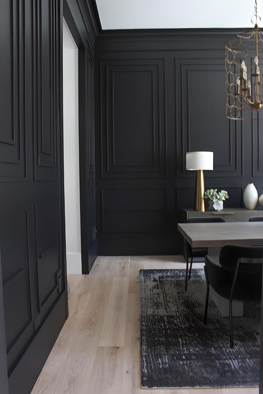
In the same vein, Sherwin Williams' Tricorn stands tall, showcasing its own captivating and impactful shade of dramatic black. These colors offer a canvas for homeowners and designers alike to play with contrasts, creating spaces that exude a timeless allure and a touch of enigmatic charm. Whether it's the immersive darkness of Cracked Pepper or the striking presence of Tricorn, these hues promise to elevate interiors with their everlasting appeal and striking contrasts.
Muted Greens: Earthy Elegance Persists
Dutch Boy Paints Ironside: This shade evokes a sense of tranquility and natural beauty, reminiscent of lush forest foliage. Its understated charm makes it an ideal choice for spaces seeking a touch of organic sophistication.


Graham & Brown Viridis: This color is a captivating muted green with subtle undertones that echo the tranquility of nature. Viridis brings forth a sense of serenity and harmony, akin to sun-dappled leaves in a serene woodland. Its soothing presence effortlessly infuses spaces with a calming, earthy allure, creating an ambiance of timeless elegance.
Stepping into 2024, these colors invite us to embrace comfort, nostalgia, and tranquility while delving into drama and elegance. Whether it's the vast bluescape, the resurgence of pastels, dark and moody tones, or the enduring charm of muted greens, this year's color trends promise to transform our spaces into vibrant, expressive reflections of our personalities.
Stay tuned as these hues weave their way into fashion, interiors, and our lives, making 2024 a kaleidoscope of color-filled experiences!


Bài của bạn trình bày ngắn gọn mà vẫn rõ ràng, mình đọc lướt vài dòng là nắm được ý chính nên thấy khá dễ theo. Cảm ơn bạn đã chia sẻ nhé. Mình cũng có thói quen xem thống kê XSMB hằng ngày, nhưng trước đây cứ phải mở nhiều chỗ khác nhau nên mất công và dễ quên. Sau đó mình tự gom lại cho tiện, kiểu lưu sẵn một trang trên soicau247.com để lúc cần chỉ mở ra xem nhanh, đỡ phải lục lại từng nơi. Mình xem chủ yếu cho quen tay thôi, ai cũng hay cập nhật theo ngày thì có thể xem thêm ở đây: https://soicau247.com/xsmb-thu-6-ket-qua-xo-so-mien-bac.html.
Mình mua vé số chủ yếu cho vui thôi, kiểu giải trí nhẹ nhàng nên trúng thì mừng, không trúng cũng chẳng áp lực gì. Trước đây nghe bạn bè bàn chuyện “cầu kèo” các kiểu nên mình tò mò thử tìm hiểu, mà mới đầu thấy loạn thông tin nên cũng hơi nản. Sau đó mình theo dõi một thời gian, thấy có vài thứ hay bị lặp lại nên bắt đầu ghi lại vài dòng mỗi lần đọc nhận định, rồi so với kết quả để tự kiểm tra xem có bị cảm giác “tưởng đúng” không. Thỉnh thoảng mình ghé soicauxsmb.io để có thêm chuyện tán gẫu, nhưng luôn nhắc bản thân là đừng tin tuyệt đối.…
Mình coi dự đoán miền Bắc chủ yếu để giải trí, đọc xong tự đối chiếu xem suy nghĩ của mình có lệch nhiều không. Hồi trước mình hay chọn theo linh cảm, nhưng càng theo dõi càng thấy dễ bị cuốn vào mấy dãy số nhìn “đã mắt” mà chẳng có căn cứ. Gần đây mình hay lượm nhặt du doan mb từ vài chỗ khác nhau, rồi tự lọc lại, ưu tiên những nhận xét có lý do rõ ràng hơn là kiểu ném ra vài con số cho xong. Trúng thì vui thật, nhưng mình luôn nhắc bản thân đây vẫn là may rủi, đừng để ảnh hưởng tâm trạng. Mình cũng thích xem bình luận của…